Bring a spark to children’s lives.
De Regenboogboom foundation is a charity that helps children in need. From the stories we heard and learned from, the foundation may be the Netherland’s best-kept secret. Inspired by the Rainbow Trust from the UK, the organisation focuses on helping children in need in a very different way. Where many other similar organisations focus on relief or sympathy, De Regenboogboom puts empathy and autonomy at work.
In the past years De Regenboogboom has built a solid network of volunteers and has brought strong people into its management. However they started facing several challenges that troubled their growth. They also learned that not only children, but also adults are inspired and helped by their philosophy.
De Regenboogboom came to us with 3 questions:
1. How can we appeal to a broader audience?
2. How can we redefine what we stand for?
3. What more mature visual identity will bring our foundation to the next level?
“What Mad about you did for our support organisation is just mind-blowing.”
Renee van Zandvoort, Founder

Build Understanding & Empathy
From the very beginning we were ‘mad about’ the project and the people behind the foundation. In order to make such an emotional and psychological project a success, we really had to dive into their world of vulnerability, hope and power. After we had an in-depth meeting, we studied all their materials and read various publications. We learned from first hand testimonials, watched dozens of videos and inquired our peers for recognisable experiences.
We have a situation
The following workshop was conducted with the whole management team, complemented with experienced volunteers. The first issue to tackle was how to open up to a broader audience. Should we think in age groups? Are we more relevant for some diseases, and less for others? Should we keep focusing on hospitals or extend our active space? What is different and shared in our approach to children and adults?
We solved the question by defining the emotional need state in which people find themselves: De Regenboogboom empowers children and adults who suddenly loose control over their life and are left vulnerable. Once we had this clear, we redefined the offering of the charity, looked at the specific role and invitation of the brand and clearly defined the human need they tap into. De Regenboogboom lets you shine again.
A new brand, a new future
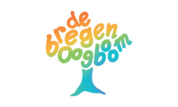
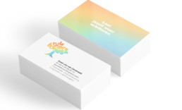
When we showed De Regenboogboom the synthesis of the new strategy and brand identity, we liberated them from the burdens that obstructed their growth. Less rainbow fairy tales, more colourful strength. We distilled an empowering brand essence, and a tagline that appeals to a broader audience. The new logo is much more recognisable. You don’t even have to be able to read to understand the new logo.
De Regenboogboom is now deploying its new vision and identity across the entire organisation and we are helping them to redesign their marketing platform.